
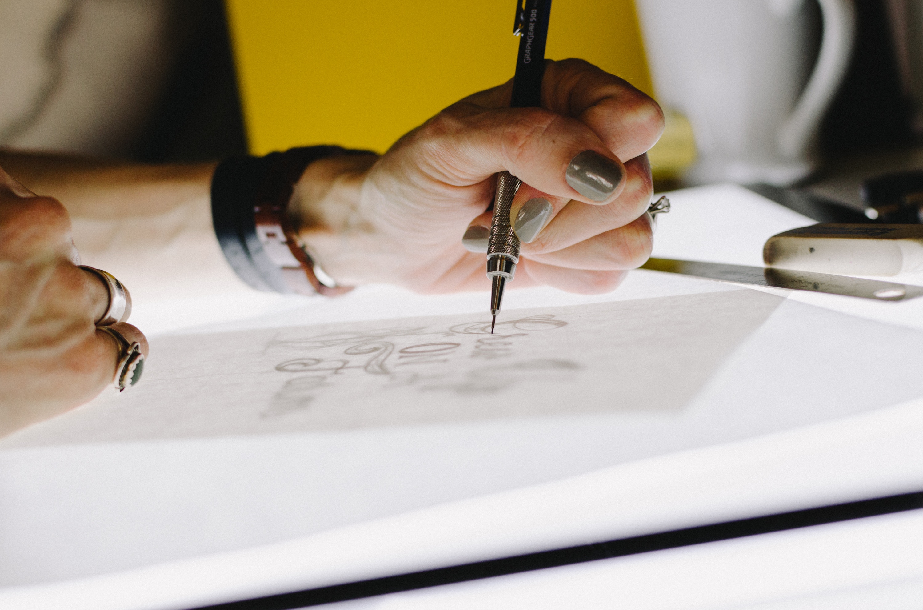
Now that we’ve determined that a brand is more than a logo, let’s go further and look at each one individually. So this week, let’s talk about what makes a good logo exactly? We’ve laid out some easy recommendations that will aid you in making an iconic design.
Limit Complexity
A minimalist approach to logo design is often the most effective. The simplest design allows your logo to be used across a wide range of media (think business cards, billboards, websites, etc). A simple logo is more easily recognized which means that it has a greater chance of having an endless and enduring quality. Perfect examples of logos like this are from corporations such as Apple, Google, FedEx
Keep it Relevant
Your logo should appropriately reflect the business it represents. Make it relevant to the industry, your potential clients, and to the audience you’re catering to. You will need to do a lot of in-depth research in order to determine your client’s world. Without this knowledge, designing a logo that will successfully separate your business from your competitors will be a challenge.
A word of caution, your logo doesn’t have to literally reflect what your company actually does. Just because your company builds airplanes, doesn’t mean your logo has to be a plane.
Make it Stand Out
A distinct design is necessary to distinguish your from your adversaries. It has to have a noticeable aspect or unique style that will be sure to grab your future client’s attention. So how can this be done? Start by focusing on making the design so recognizable that just the outline of your logo stands out. Making the decision to work only in black and white may help you construct a more distinct shape. While color is important, it is secondary to the form or model of you logo.
Be Memorable
You only have so much time to make an impression so you’ll need a logo that is easy to commit to memory after just once glance. For instance, pedestrians looking at a bus passing by or noticing a billboard while driving don’t have enough time to take it all in, so we need to grab their attention quickly.
So how do we accomplish this one element of logo design? I suggest thinking about designs that made an impact on you in the past. What is it about those logos that stands out to you? Why do you remember them?
Think Small
I realize that your first instinct might be to imagine your logo across billboards but it’s important to remember that it will need to accommodate a smaller application like a business card or badge. Remember that your logo will need to be adaptable, this will end up saving you substantial amounts of cash when it comes to printing, potential redesign, and much more.
When in comes to a versatile logo, simplicity is key. Your logo should work at a minimum size of about one inch without losing any detail and the best way to achieve this is to keep it simple. This will also increase your chance of creating a design with some significant staying power.
Be Iconic
Most logos work best with an icon. By icon, we mean a small illustration, shape or image that goes along with the name of the company. Let’s look at Deutsche Bank for example, who paid $16 million back in the 90s to create their new logo that included an icon that everyone would be able to associate with their brand, without the name being present – that’s what a truly great icon, and brand, will accomplish. But, as simple and expensive as Deutsche’s is, it’s never truly been elevated to that level. BP, on the other hand, has certainly done this, along with the likes of Facebook and Twitter, with the F and T respectively. If designed well, the icon can be incorporated into extended branding for decks, business cards and much much more.
By following this helpful little guide, your logo design has every chance of gaining iconic status. Stay tuned for next week’s blog, we’ll be discussing how to design and develop a great brand identity.